

Website examples
Best builder websites in Australia: four approaches
The quick answer
The best builder websites show relevant projects and explain the kind of building service on offer. SHORE, BIC Construction, JOSCON Tasmania and Rustic Touch take different approaches to portfolios, design choices and enquiries. Compare the example closest to your buying process, then build an original site around your own work and scope.
On this page
Key takeaways
- A custom-building portfolio and a house-design catalogue answer different customer questions.
- SHORE's homepage gives project names, suburbs and construction status alongside the work.
- Project pages should explain the builder's role and distinguish completed work from proposed work.
- Match the first action to the customer, whether that is exploring projects, comparing designs or arranging a consultation.
The best builder websites help a prospective client recognise the kind of project a business is equipped to deliver. The right example for a custom home builder may be a poor model for a company selling a collection of house designs. Start with that distinction before comparing typography or photography.
We reviewed four Australian websites on 9 October 2026, including our work for SHORE. The other three are external examples with no Kavera client relationship. Each offers a different lesson for website design for builders: explaining an integrated service, showing architectural construction, helping people compare designs or making a specialist approach tangible.
Which builder websites should you compare?
Choose a website that serves a similar buying process to yours. The table describes what each example helps a visitor do. It does not rank the quality of the builders or their completed homes.
| Business | Location | Best for | Standout | Mobile score |
|---|---|---|---|---|
| SHORE | Sydney, NSW | Integrated design and construction | Named projects with location and construction status | 81 |
| BIC Construction | Sydney, NSW | Architect-led residential projects | A direct route into the project portfolio | 57 |
| JOSCON Tasmania | Tasmania | Choosing a home design | Design browsing beside a display-home route | 65 |
| Rustic Touch | Central Coast, NSW | A distinct building approach | Separate custom-build and pre-designed options | 57 |
Mobile speed scores are a snapshot from one test and can vary. See how we reviewed these websites.
1. SHORE, Sydney
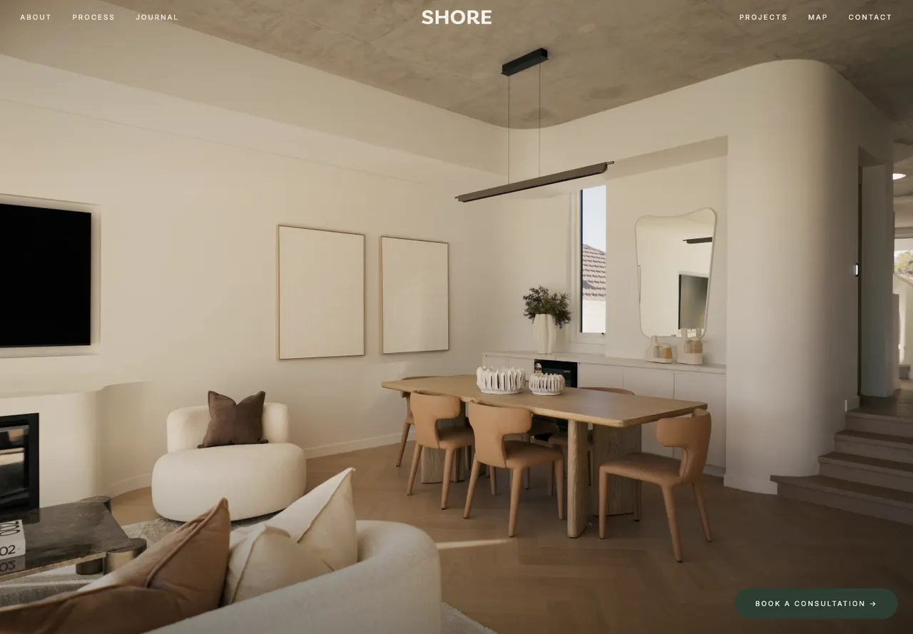
SHORE brings architecture, interiors and construction into one practice. Its website needs to explain that relationship as well as show the residences. On the homepage, the introduction describes the integrated service and the project sequence gives each residence a name, suburb and status.1
That status is a useful detail. The page distinguishes a completed project from work under construction and a project with a stated future completion. A visitor can understand what the imagery represents rather than assuming every residence shown is already finished.
Kavera note: We built SHORE's website. The homepage checked for this guide showed SOL in Bondi Beach as completed and FERN in Balgowlah as under construction. Those visible labels make project context part of the gallery itself.
The first mobile screen is image-led with a consultation action. The service explanation appears further down. This is a deliberate trade-off: a visitor arrives through the work before reading how the practice operates. If your business name and imagery do not already explain the offer, an equally sparse opening may leave people guessing.
Our SHORE case study shows the website work in more detail. The pattern to borrow is the connection between the service model and the project information. It does not require copying the full-screen composition.
2. BIC Construction, Sydney
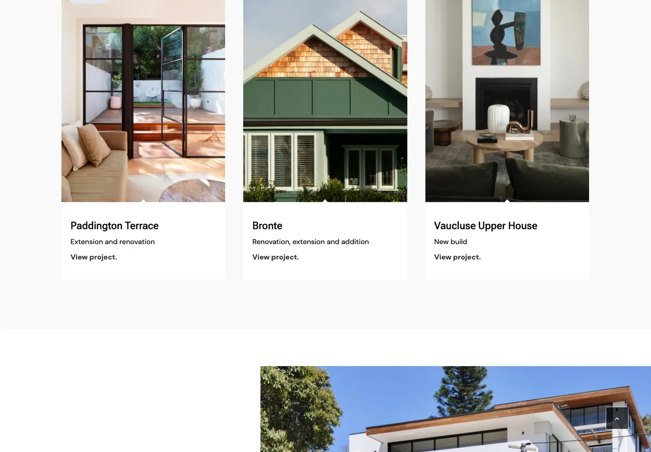
BIC introduces architecturally designed residential construction and gives the first mobile screen a portfolio action. Its homepage project cards lead to named projects, including Paddington Terrace, Bronte and Vaucluse Upper House.2
That puts the work close to the arrival point. A homeowner with an architect can start comparing relevant projects before reading a long company history. The introductory copy names new builds, renovations and extensions, which helps define the scope behind the photographs.
For an original builder website, use this as a reason to write project captions carefully. Explain your role, the type of work and the location. If an architect, interior designer or photographer contributed, credit the relevant people accurately rather than allowing the page to imply that your business supplied everything.
A project-first opening still needs a contact path later in the journey. BIC's homepage invites visitors to discuss an upcoming project. The lesson is to give a reader enough project context to make that conversation more useful, without demanding an enquiry before they have seen the work.
3. JOSCON Tasmania
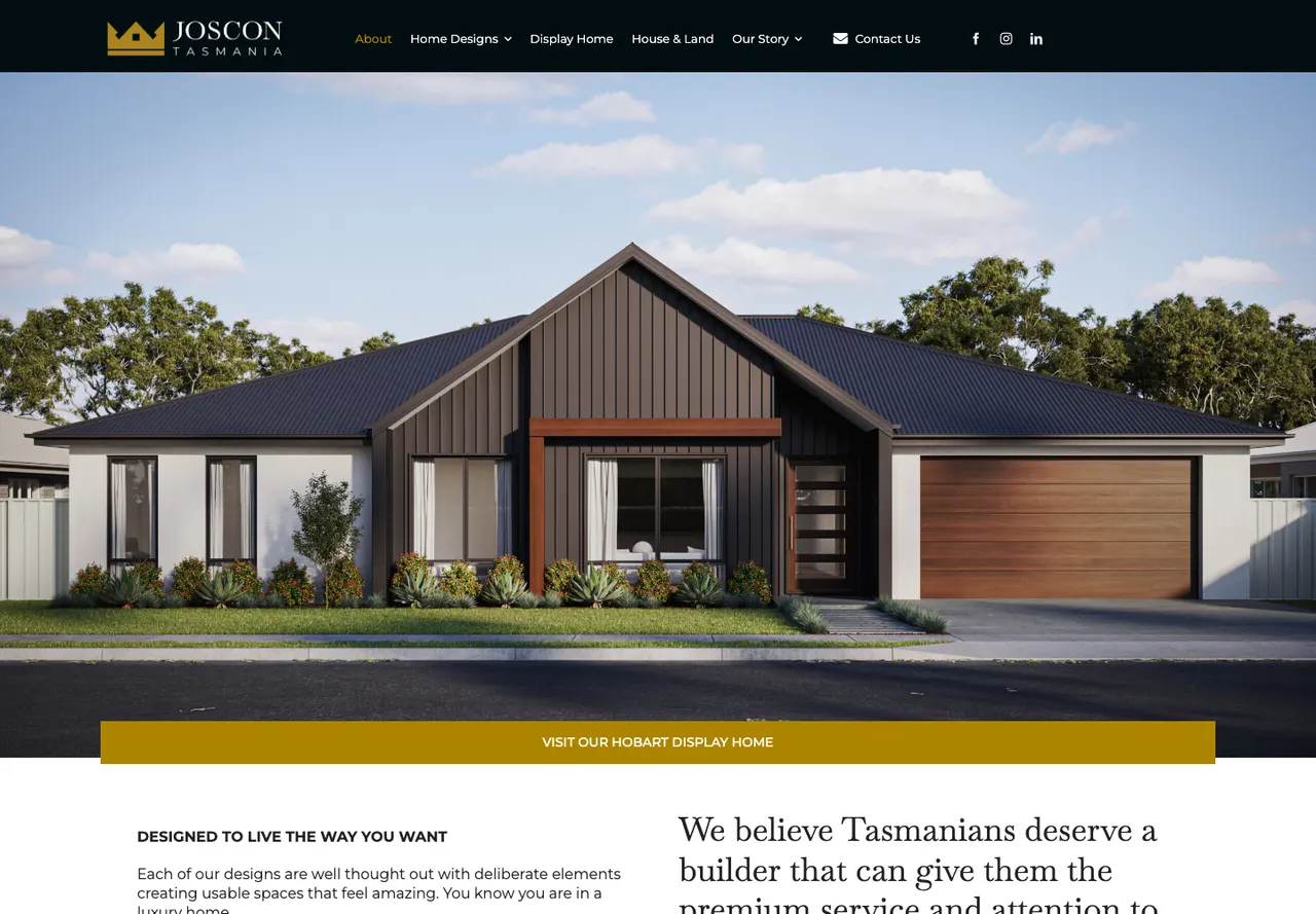
JOSCON's first mobile screen offers two distinct routes: view the house designs or visit the display home. This fits a visitor who wants to explore an available design and then see a physical example.3
The homepage also introduces house-and-land opportunities and links to design content. Those are different decisions from commissioning a fully bespoke residence. Someone considering a design collection needs a way to compare the options, while a custom-build client may need to understand collaboration, constraints and process first.
Use the underlying choice in your brief. If you sell a repeatable collection, organise the designs around the information buyers use to shortlist them. If a display home is open, make its current visiting arrangements easy to find. Keep availability and opening information current instead of treating those pages as permanent brochure copy.
A prominent design catalogue is useful only when it reflects your offer. A renovation specialist should not add a house-design library just because it looks impressive on another builder's site.
4. Rustic Touch, Central Coast
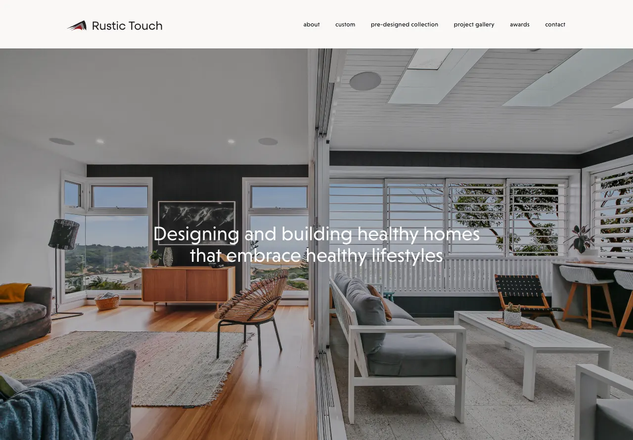
Rustic Touch gives its building approach a clear place in the opening, then separates custom builds from a pre-designed collection. The homepage follows with featured projects. The reader can explore either the service model or the work behind it.4
This is a useful structure for a builder with a particular design approach. Explain what the approach changes in the project and show relevant work nearby. Broad language about quality is harder to assess when every builder in the shortlist uses it.
Rustic Touch describes its focus in terms of healthy homes and lifestyles. We are reviewing how that positioning is presented, not validating health or building-performance claims. If you make a technical claim on your own website, tie it to the actual specification or assessment you can supply.
The useful design decision is the separation of two buying routes. A pre-designed collection can reduce the number of initial choices. A custom build needs room for a more open project brief. Give each route its own explanation so visitors understand what is fixed and what can change.
What should a builder project page explain?
A project page should tell a reader whether the work is relevant to their own plans. Photographs do part of that job. A short factual record supplies the context they cannot see in an image.
| Project detail | What the reader can judge | What to avoid |
|---|---|---|
| Type of work | New home, renovation, extension or another scope | Calling every project a custom build |
| Location | Whether you work in a relevant area | Revealing a private client's exact address unnecessarily |
| Your role | Construction, design or an integrated commission | Taking credit for another professional's work |
| Status | Completed, under construction or proposed | Presenting a render as a finished photograph |
| Main constraint | How the team approached the actual site or brief | A generic description pasted onto every project |
| Credits | Who supplied design, photography or other services | Omitting contributions where they affect the story |
Write one useful paragraph about the work before filling the page with images. A narrow site, occupied renovation or complex access condition can explain why a project is relevant. Include those facts only when you have permission and the detail is accurate.
How SHORE gives a project useful context
SOL in Bondi Beach shows how a short project description helps a reader understand the photographs. Its page names the work, completion year and people involved.7
| Project detail | SOL, Bondi Beach |
|---|---|
| Project and location | SOL, Bondi Beach |
| Work type | Residential duplex |
| Status | Completed 2025 |
| Website decision | Name, suburb and status accompany the project image and onward link |
| Role and credits | Architect and builder: SHORE; interior design: Tina Kosta Studio |
| Details to inspect in the photographs | Curved walls, skylights, travertine and timber finishes described on the project page |
Kavera designed and developed SHORE's website. For your own projects, add a short account of the client's brief and the site challenges your team solved.
For project photography, plan both wide and close views. A full-room image shows spatial relationships. A detail image can show the construction or finish being discussed. Captions should explain the work rather than repeat the same complimentary adjective under every photograph.
Should a builder website lead with photos or text?
It should give the visitor enough information to identify the offer while making the work easy to inspect. The four examples balance those needs differently.
SHORE's mobile arrival concentrates on the residence and a consultation action. BIC exposes a portfolio route. JOSCON offers design and display-home choices. Rustic Touch leads with its building approach. None of those openings is automatically right for a small renovation contractor.
Ask a person unfamiliar with your company to open the homepage and describe what you build, where you work and how they would start a conversation. If they cannot answer, add the missing information. You do not need to replace every photograph with a paragraph; a precise service line or project caption may be enough.
Keep important wording as page text instead of embedding it in an image. On a phone, a decorative title may crop while the image resizes. Read the opening at a narrow width before approving the desktop composition.
How should a builder enquiry form work?
Ask for information that helps you assess the next step. A builder considering a renovation may need the suburb, project type and planning stage. A design-and-build practice may need to understand whether the client already has drawings. The right questions follow the service.
Offer a clear choice between “I have plans” and “I need help with design” if the business accepts both types of enquiry. Explain who handles design in each route and ask for the planning stage. Do not imply that a design-and-build service automatically accepts construction-only work without checking the actual offer.
Explain why you need a budget range if you ask for one. Use ranges that reflect the projects you take on and allow a visitor to say they need guidance. Avoid turning an early conversation into a detailed estimating exercise the client cannot complete.
Uploads can help when a prospect has plans but they should not be the only route to contact. A visitor browsing on a phone may not have files ready. Tell them what happens after the enquiry and how they can supply further information later.
The same care applies to consultation buttons. Tell visitors whether they are requesting a conversation or choosing a time in a calendar, then explain what to bring to that first discussion.
What did the builder website measurements tell us?
The four sites lead with consultations, portfolios, design choices or navigation. None showed a telephone link before scrolling in our mobile review. A residential building enquiry usually needs context, so give visitors room to explore your work before asking them to describe their project.5
When testing your own site, check a project page as well as the homepage. Large photographs may be the main content a buyer wants to inspect. Compress them to the size needed on screen, provide descriptive alternative text and preserve enough detail to understand the work. Loading an entire full-resolution photo library at once is rarely necessary for the first view.
What should go into your builder website brief?
Bring a small set of representative projects and accurate business information. Each project should have usable images, a scope description, the team's role and permission to publish the details.
Then decide the main route through the site. A custom builder may need service information, completed projects and an enquiry form. A business with a design collection may need a catalogue and display-home information. A renovation specialist may need before-and-after context with clear labels and no invented project history.
Our website design for builders covers those structures. The website redesign checklist is useful if you already have project URLs that should survive a rebuild. Keep their addresses and useful content in the migration plan rather than starting the portfolio again without redirects.
How were these builder websites reviewed?
We reviewed each website on desktop and mobile on 9 October 2026, looking at its projects, service information and enquiry options. BIC's project screenshot was updated on 10 October. We did not submit enquiries or assess sales results.5
Speed scores come from one mobile Lighthouse test per website. They describe that test, rather than every visitor's experience. Separate tests can produce different results: SHORE scored 81 here and 73 in our tradie comparison.6
SHORE is our client work. The other three sites are independent examples selected for their project presentation and enquiry options.
Common questions
What makes a good builder website?
A good builder website explains the work the business takes on and shows relevant projects with accurate context. Visitors should be able to understand the service area, the builder's role and the next enquiry step. Named project pages, clear status labels and useful process information help a prospective client compare the business with their own plans.
Should builder websites show project prices?
Show prices only where the business can explain what they cover and keep them current. A standard design and a complex renovation may need different pricing approaches. If a published figure cannot represent the scope fairly, explain the factors that affect the quote and what information is needed to begin a project discussion.
Can I use renders on a builder website?
Renders can help explain proposed work when they are clearly labelled and you have permission to use them. Do not present them as photographs of completed construction. Include the project status and distinguish the builder's role from design work supplied by another professional. Keep those labels visible near the relevant images.
How many projects should a builder website show?
Choose enough projects to demonstrate the work you want to be considered for, with useful detail on each. A smaller group of relevant projects can be easier to assess than a large uncaptioned gallery. Keep older work when it remains representative and add new projects with accurate scope, status, credits and publication permission.
Sources
- SHORE public homepage, inspected 9 October 2026SHORE. Accessed .
- BIC Construction public homepage, inspected 9 October 2026BIC Construction. Accessed .
- JOSCON Tasmania public homepage, inspected 9 October 2026JOSCON Tasmania. Accessed .
- Rustic Touch public homepage, inspected 9 October 2026Rustic Touch. Accessed .
- Kavera mobile website checks and screenshots, 9 October 2026; method explained in this guideKavera Digital. Accessed .
- Lighthouse performance scoring and test variabilityChrome for Developers. Accessed .
- SOL project details and credits, checked 10 October 2026SHORE. Accessed .

Arthur Syrios
About ArthurLet’s talk.
Tell us what your business needs and we will point you to the right option.
Website design for builders