

Website examples
Best tradie websites in Australia: 16 examples across 8 trades
The quick answer
Useful tradie websites make the service, location and next step easy to find. These 16 Australian examples span eight trades, with mobile performance tests and screenshots. Borrow Scott Electrics' visible contact options, SHORE's project presentation or Portos' early quote form, then check that the approach suits your customers.
On this page
Key takeaways
- We compared 16 Australian trade business websites using desktop and mobile captures on 9 October 2026.
- A quote button and an above-the-fold quote form are different features and need separate checks.
- A Lighthouse mobile score measures a lab loading test rather than leads, workmanship or customer satisfaction.
- SHORE is Kavera's own website work and its inclusion is disclosed in the comparison.
Tradie websites need to suit the way customers choose the work. An electrician handling a power fault needs a different first screen from a builder discussing a new home. We opened 16 Australian business websites to compare those choices on mobile and desktop.
Use this shortlist to choose features for your own site. It covers eight trades across five states and the ACT with two examples per trade. Our selection rewards a useful service explanation, a clear next step or a specific way to show the work.
The guide supports our tradie website design service. SHORE is our own website work and we identify it below. Plumbers have a separate guide to plumber website examples in Australia.
Which tradie websites are worth looking at?
Scott Electrics is a useful reference for visible mobile contact, SHORE for project presentation and Portos for an early quote form. The full shortlist lets you compare the same features across electricians, builders, landscapers, painters, roofers, tilers, handymen and concreters.17
| Business | Location | Best for | Standout | Mobile score |
|---|---|---|---|---|
| Scott Electrics | Sydney, NSW | Electrician: mobile call and quote choices | Phone and quote controls sit outside the mobile menu. | 54/100 |
| Response Electricians | Perth, WA | Electrician: different customer groups | Separate routes for domestic, commercial and property-management customers. | 53/100 |
| SHORE (Kavera work) | Sydney, NSW | Builder: builder project presentation | Named projects and a persistent consultation action share the mobile journey. | 73/100 |
| 360 Building Solutions | Canberra, ACT | Builder: a specific building focus | Canberra home positioning sits alongside accessible phone and contact actions. | 55/100 |
| Ausscapes | Geelong, VIC | Landscaper: service organisation and availability | Detailed landscaping categories sit behind a capacity notice captured on 9 October 2026. | 48/100 |
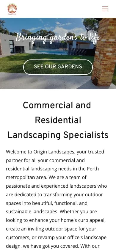
| Origin Landscapes | Perth, WA | Landscaper: garden gallery access | The opening garden image offers a direct route into the gallery. | 65/100 |
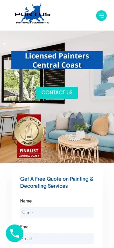
| Portos Painting & Maintenance | Central Coast, NSW | Painter: starting a quote early | The first quote fields and a floating call control appear on mobile. | 65/100 |
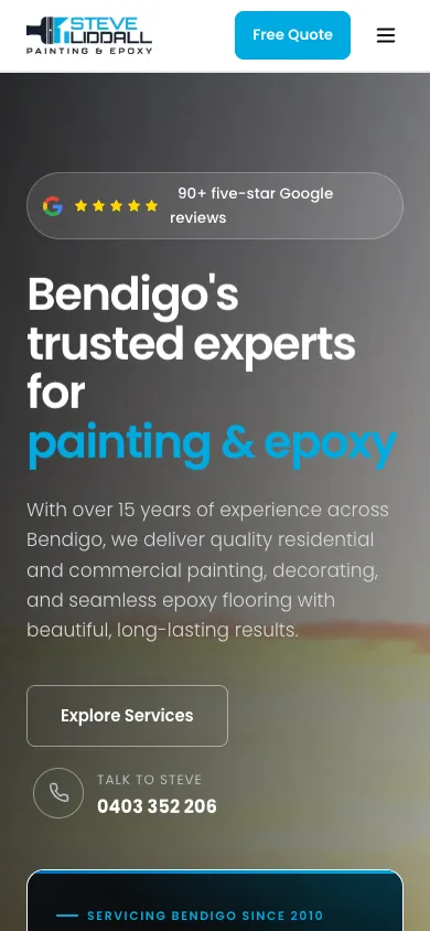
| Steve Liddall Painting and Decorating | Bendigo, VIC | Painter: painting and epoxy services | Separate service groups help customers distinguish painting from epoxy work. | 80/100 |
| Powerdrive Roofing | Perth, WA | Roofer: roofing contact visibility | Call controls remain close to a clear service explanation. | 90/100 |
| Brisbane Roofing Solutions | Brisbane, QLD | Roofer: a specific inspection step | The enquiry path explains that the next step is an inspection and quote. | 84/100 |
| Todd The Tiler | Perth, WA | Tiler: a compact project route | A short introduction leads into more information and projects. | 64/100 |
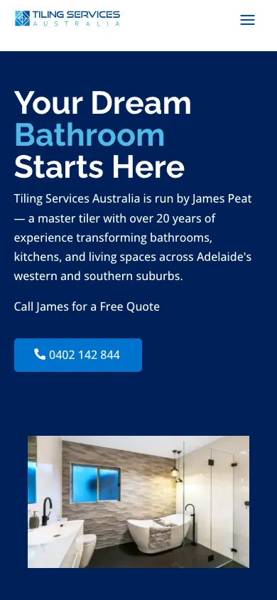
| Tiling Services Australia | Adelaide, SA | Tiler: a named local contact | The opening identifies a tiler, the area and a direct call option. | 99/100 |
| Get Handyman | Melbourne, VIC | Handyman: task-based enquiries | An estimate form lets the visitor select a recognisable job. | 57/100 |
| Yatara Property Maintenance | Adelaide, SA | Handyman: evidence for small jobs | Specific captions explain small repair and installation tasks. | 67/100 |
| Precision Concreting QLD | Sunshine Coast, QLD | Concreter: domestic and commercial routes | Separate residential and commercial pages suit different buying needs. | 63/100 |
| Cammcrete | Melbourne, VIC | Concreter: finish choices and process | Surface options lead into a clear sequence from enquiry to finishing. | 71/100 |
All scores come from single Lighthouse mobile runs on 9 October 2026 and measure simulated loading performance out of 100. Use them to identify loading issues to investigate.1718
How did we test these website examples?
We captured each homepage at 1440 × 900 on desktop and 390 × 844 on mobile, then checked contact controls, quote fields, displayed reviews and page structure. We left popups and cookie notices as loaded so the captures show the opening experience.17
A first-screen call link had to be visible and tappable without scrolling. For a sticky call to action, we looked for a fixed or sticky contact control during a separate scrolling pass. A form counted above the fold when at least one actual enquiry field appeared on the first mobile screen. A quote button alone did not count.
We also ran Lighthouse mobile performance tests and recorded Largest Contentful Paint (LCP). LCP reports when the largest visible image or text block renders during that test. Network conditions and the test machine can change the result, so compare repeat runs before paying for a rebuild based on one number.18
Our service and suburb counts cover the distinct pages found in the stated navigation or sitemap source. Page anchors, project pages and blog posts do not count as separate service pages. A suburb mentioned in a paragraph does not count as a suburb page. These counts describe site structure, not indexed pages or Google rankings.17
What can electricians borrow from these examples?
Electrician websites separate urgent contact from the information a customer needs before booking planned work. Scott Electrics and Response Electricians show two different ways to organise those paths.12
1. Scott Electrics, Sydney
Scott Electrics puts a phone icon beside the quote button in its mobile header. The first screen also introduces the Sydney electrical service and displays a Google review panel. A customer chooses a call or an enquiry without opening the menu.117
The service navigation names specific jobs such as switchboard upgrades, ceiling fans and EV chargers. That is more useful to a person with one job in mind than a broad paragraph about doing electrical work. Borrow the combination: clear job names inside the menu and direct contact outside it.
Our mobile score was 54 with LCP at 29.27 seconds. This was a single Lighthouse lab run under simulated mobile throttling, where large hero media can weigh heavily on the result. Keep the contact structure, then test the weight of the hero and review integration before copying the presentation.17

2. Response Electricians, Perth
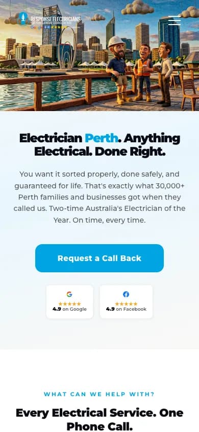
Response Electricians organises its homepage around different customer groups: homeowners, businesses, property managers and strata. Each group receives its own description and onward link. That gives a property manager a relevant route without making a homeowner read commercial maintenance details.2
Its first mobile screen favoured a callback button and rating badges. We did not find a visible first-screen telephone link in our test, although a fixed call button appeared after scrolling. A callback path suits a non-urgent enquiry; an urgent visitor benefits from a call option at the top as well.17
Borrow the audience separation if your business serves both domestic and commercial customers. Give each audience its likely jobs and enquiry requirements. Keep the initial decision small enough to make on a phone.
What should a builder website show before asking for an enquiry?
A builder website should help a homeowner judge the type of projects the business handles and understand the next conversation. SHORE uses individual project stories while 360 Building Solutions introduces its focus on Canberra homes.34
3. SHORE, Sydney
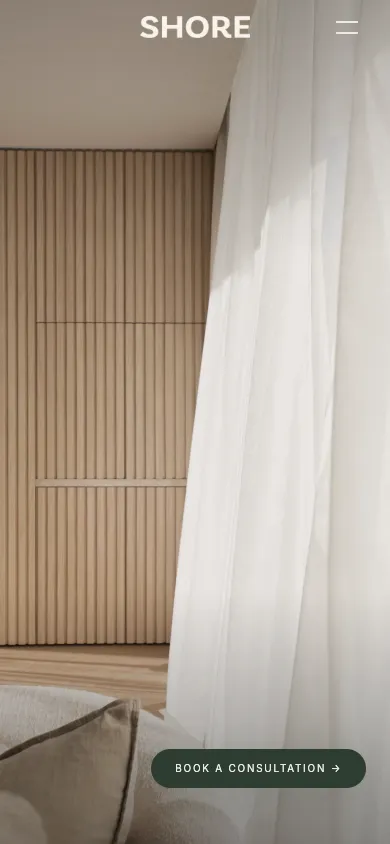
SHORE gives its residential work space on the screen and keeps a consultation button available on mobile. The homepage identifies projects by name and location and distinguishes completed work from work under construction. Each image has a clear project context.317
This is a considered purchase. The useful pattern is to let someone explore relevant homes before asking them to describe their own. Use project pages to explain the brief, constraints and completed work with photographs you have permission to publish.
The first mobile capture is dominated by imagery. The consultation control gives visitors an action while the service explanation arrives later. Our test gave SHORE 73 for mobile performance with 5.15 seconds LCP.17
Kavera note: We designed and developed SHORE's website, including its editable project and journal system. Our SHORE website project explains that scope.19
4. 360 Building Solutions, Canberra
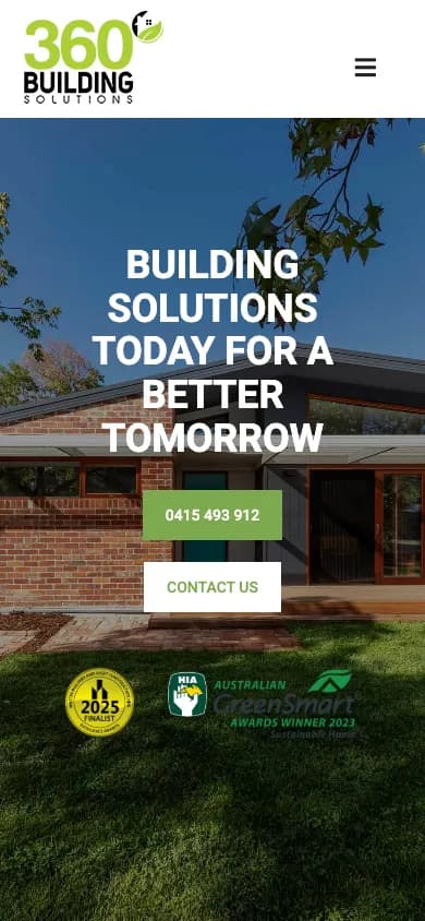
360 Building Solutions combines home photography with a phone number and contact button on the first mobile screen. Further down, its copy explains a focus on sustainable and energy-efficient homes for Canberra. Its project navigation gives a prospective client a route into individual builds.417
Borrow the link between specialisation and project evidence. If you build on difficult blocks, show a relevant project and explain the problem you solved. If your work centres on a building method, explain how that changes the client's choices. Avoid relying on an unexplained badge as the whole argument.
The homepage is long and image-heavy. Its 55 mobile score is a reminder to check load behaviour even when the opening contact choices are easy to find.17
How can landscapers make a large service range easier to understand?
Landscaping websites separate design, construction and maintenance while showing visitors the finished spaces. Ausscapes illustrates detailed service organisation and Origin Landscapes gives its garden gallery a direct route from the hero.56
5. Ausscapes, Geelong
Ausscapes has distinct routes for landscape design, construction and maintenance. Its construction menu then breaks the work into named capabilities including paving, irrigation and retaining walls. A visitor looking for drainage work has a specific route through the menu.5
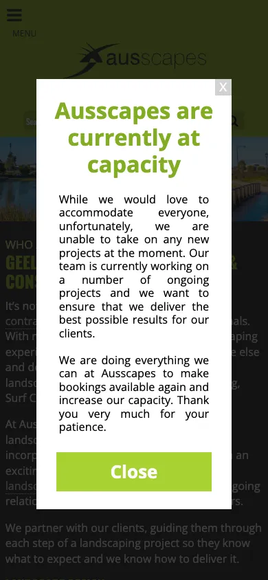
A capacity notice captured on 9 October 2026 covered the opening screen and said the team was unable to take on new projects at that date. We left it open in both captures. The notice made availability clear before a customer started an enquiry.17
Borrow the clarity about availability as well as the service menu. If you are booked out, explain the customer's next step. Review how much of the mobile screen your notice occupies.
6. Origin Landscapes, Perth
Origin Landscapes opens with a garden image and a gallery button, then explains its commercial and residential landscaping work in Perth. Testimonials appear further down the homepage. The order gives the visitor a choice between looking at gardens and reading about the service.6
The idea to borrow is an obvious route into the portfolio. Organise the gallery around the work you want more of and add enough context for someone to recognise a similar property or brief. Explain the site preparation and maintenance arrangement alongside the garden images.
We found no tappable number in the first mobile viewport. Our LCP result was 21.98 seconds. This was a single Lighthouse lab run under simulated mobile throttling, where large hero media can weigh heavily on the result. Keep an enquiry route close to the gallery and check how the opening photograph loads on a phone.17
What helps customers compare painting services?
Painting websites need to explain both the type of work and the quote process early. Portos introduces a form on the opening mobile screen while Steve Liddall separates painting and epoxy work into distinct service routes.78
7. Portos Painting & Maintenance, Central Coast
Portos combines an opening painting image with a service-and-location heading. The first quote fields begin within the mobile viewport and a floating telephone control remains available as the visitor scrolls. Visitors start the enquiry on the homepage.717
The form asks for basic contact details and a suburb. That is a useful starting point for a painting business deciding whether a job sits within its service area. Keep detailed scope questions for the stage where you need them rather than asking for a full specification before contact.
Only the top of the form fits on the first screen. Test your own form on a phone, including errors, confirmation and delivery to your inbox.
8. Steve Liddall Painting and Decorating, Bendigo
Steve Liddall gives painting and epoxy flooring separate navigation groups. The homepage also explains its sequence from enquiry through preparation to a final walkthrough. A person asking about a garage floor has a relevant service route alongside the painting options.8
The opening mobile screen has a quote button and a direct call option. Review references sit alongside the introduction.17
Borrow the service grouping and process explanation. Show what you need to quote, what preparation involves and how the client checks the finish. The site scored 80 in our mobile loading test.17
How should roofers explain the first step?
Roofing websites help customers start with an inspection or a discussion before choosing a repair type. Powerdrive keeps telephone contact close while Brisbane Roofing Solutions describes an inspection-and-quote route.910
9. Powerdrive Roofing, Perth
Powerdrive names restoration, repairs and replacement in its opening copy, then provides prominent call controls. Its mobile layout includes fixed contact actions and separate navigation for services and suburbs. The service menu and call controls give visitors direct routes from the opening screen.917
Borrow the separation between the roofing problem and the proposed service. Start with the homeowner's problem, such as a leaking roof, then explain how you decide between repair and replacement. Explain what the inspection establishes and what information you need to prepare.
Our mobile score was 90 with LCP at 2.91 seconds. The site also has a large location-page structure.

10. Brisbane Roofing Solutions, Brisbane
Brisbane Roofing Solutions states the next step as a roof inspection and quote. The first mobile screen shows the telephone number above the main heading and a booking link lower down. Its navigation separates restoration work by roof material and includes project galleries.1017
Borrow the specific explanation of what happens after contact. If an inspection is required before a quote, say so. Give customers a way to recognise the roof material or problem without expecting them to know trade terminology.
The mobile opening is busy, with large headings and a review widget near the bottom. Check that additions such as review popups leave the inspection button readable.

What can tilers show without overcomplicating a small website?
Tiler websites need to explain the job types they handle and offer a clear way to discuss the work. Todd The Tiler emphasises its introduction and project route while Tiling Services Australia places a named contact and telephone action near the top.1112
11. Todd The Tiler, Perth
Todd The Tiler uses a compact opening with a short business introduction and buttons for more information and projects. Its navigation also separates services, frequently asked questions and contact. That is a manageable structure for a visitor comparing a small set of local businesses.11
Borrow the restraint in the initial choices. Use project photographs to show the tile layout, transitions and finished spaces that matter to the jobs you want. Pair close-ups with wider views to show both detail and scale.
Our first mobile viewport had no tappable telephone link. The moving heading is another feature to assess for readability before copying it. A simple site still needs a contact route that matches how customers want to enquire.17

12. Tiling Services Australia, Adelaide
Tiling Services Australia introduces James and the western and southern Adelaide service area before offering a direct call. Further down, its services distinguish bathrooms, splashbacks, living areas and outdoor work. Those categories describe spaces a homeowner already understands.12
Borrow the combination of a named person, a usable service area and familiar job categories. If you are a sole operator, introduce yourself so customers know who they will speak to.
This site returned 99 for mobile performance with 2.12 seconds LCP, the highest score in this test set.17
How can handymen explain the small jobs they take on?
Handyman websites explain their scope through recognisable jobs. Get Handyman puts job selection in its enquiry form while Yatara Property Maintenance labels individual examples of smaller work.1314
13. Get Handyman, Melbourne
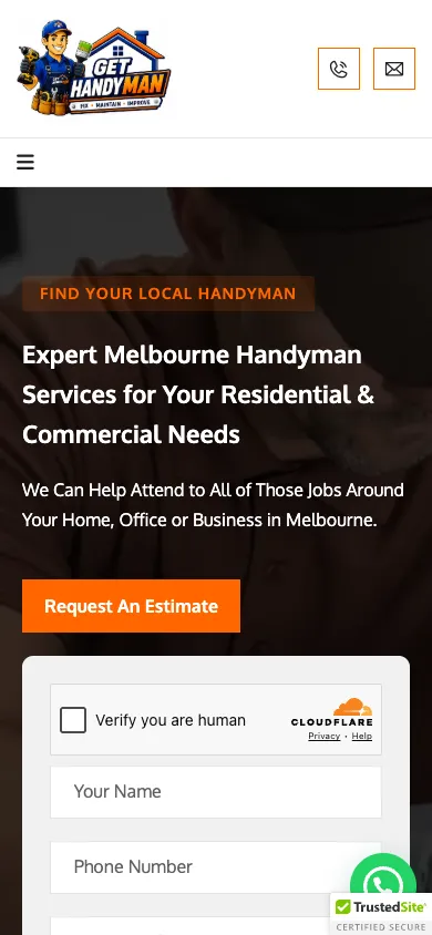
Get Handyman offers an estimate form beneath its opening introduction. The form includes a service selector with tasks such as furniture assembly, door installation and clothesline installation. The service selector gives customers a job category to choose instead of asking for a technical description.13
Our first mobile screen contained contact fields and a telephone icon in the header. It also showed a human-verification control beside the form.17
Borrow the practical task names. Keep an option for a job that does not fit the list and explain which photographs help you assess it. Test the service selector and any spam controls on a real phone.
14. Yatara Property Maintenance, Adelaide
Yatara's homepage labels jobs such as a re-oiled bench, a corner shelf and a replaced door handle. Customers with small repairs can see that the business handles work of that scale.14
Borrow the captions rather than relying on a mixed photo gallery. Explain what was repaired or installed and show the finished result. Small jobs need evidence too, even if they do not justify a long case study.
The opening mobile capture cropped the hero content and showed no tappable number. That is a reason to check the first screen separately from the desktop design. Borrow the specific job captions and give your mobile introduction a clearer layout.17

How can concreters help customers choose the right work?
Concreting websites help customers identify their project type or preferred finish before asking for details. Precision Concreting QLD uses residential and commercial routes while Cammcrete introduces common finish choices and its work sequence.1516
15. Precision Concreting QLD, Sunshine Coast
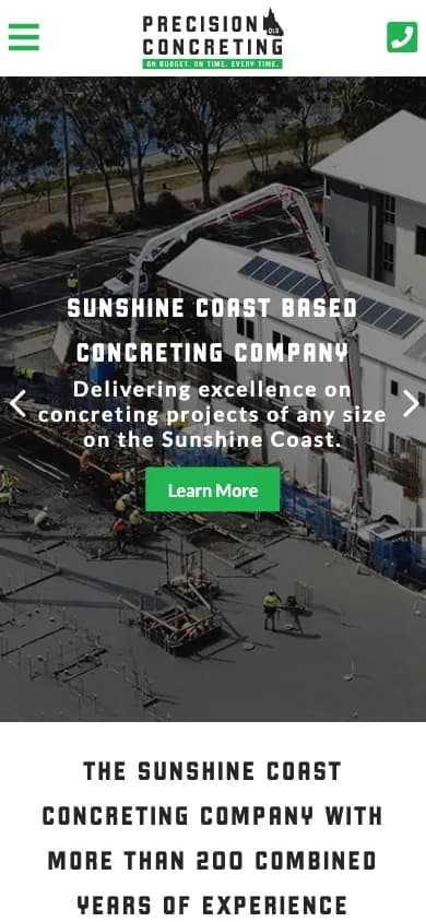
Precision Concreting QLD gives residential and commercial work their own pages. The homepage describes different job types under those headings, including slabs and driveways for residential visitors. Commercial buyers have a direct route to relevant work.15
Borrow the split when your customers need different evidence. Explain access and finish choices for homeowners. Give builders details about drawings, scheduling and the scale of the pour. Give each a relevant next page.
The mobile header showed a telephone icon and a fixed call control appeared further into the page. Our LCP result was 10.84 seconds. Keep important contact details usable while large project images load.17
16. Cammcrete, Melbourne
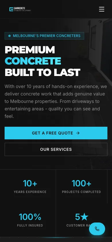
Cammcrete introduces driveways, exposed aggregate and coloured concrete as distinct options. It then explains a sequence covering enquiry, site assessment, preparation, pouring and finishing. The sequence explains the broad stages before a customer requests an individual quote.16
Borrow the process explanation and finish categories. Add your own project photographs showing how each finish looks across a full driveway or outdoor area. Use the enquiry to establish access, approximate dimensions and the intended use rather than implying every site has the same price.
A floating phone icon appeared on the first mobile screen and remained available during our scroll checks. The main quote button also appeared early. Those routes give a visitor a choice between a conversation and a written enquiry.17
What separates the most useful tradie websites in our sample?
The clearest difference was how each site connected its service explanation to a contact choice. Our counts distinguish first-screen phone links, sticky actions and early forms, giving each feature its own check.17
| Feature checked | Result in our sample | What the count means |
|---|---|---|
| Tappable phone link on the first mobile screen | 10 of 16 measured | Visible without opening the menu or scrolling. |
| Sticky or fixed mobile contact action | 7 of 16 measured | Appeared during our scroll samples; it may not show at every position. |
| Quote form beginning on the first mobile screen | 2 of 16 measured | At least one enquiry field visible, not necessarily the whole form. |
| Homepage rating or testimonial displayed | 10 of 14 measured; 2 unknown | Display only; authenticity and review totals were not audited. |
These are the individual measurements behind the contact counts. A dash means unknown. Service and suburb columns refer to the listed pages we found, including service overview pages. SHORE uses its sitemap; the other sites use captured navigation. Regional coverage hubs do not count as individual suburb pages.17
| Business | LCP, seconds | First-screen call | Sticky contact | Form starts above fold | Service pages | Suburb pages |
|---|---|---|---|---|---|---|
| Scott Electrics | 29.27 | Yes | No | No | 17 | 0 |
| Response Electricians | 9.45 | No | Yes | No | 26 | 0 |
| SHORE | 5.15 | No | Yes | No | 10 | 7 |
| 360 Building Solutions | 14.5 | Yes | No | No | 16 | 0 |
| Ausscapes | 6.23 | No | No | No | 17 | 0 |
| Origin Landscapes | 21.98 | No | No | No | - | 0 |
| Portos Painting & Maintenance | 5.91 | Yes | Yes | Yes | 8 | 11 |
| Steve Liddall Painting and Decorating | 2.84 | Yes | Yes | No | 13 | 0 |
| Powerdrive Roofing | 2.91 | Yes | Yes | No | 11 | 85 |
| Brisbane Roofing Solutions | 4.26 | Yes | No | No | 16 | 0 |
| Todd The Tiler | 10.02 | No | No | No | 2 | 0 |
| Tiling Services Australia | 2.12 | Yes | No | No | 0 | 0 |
| Get Handyman | 20.62 | Yes | No | Yes | 26 | 18 |
| Yatara Property Maintenance | 7.15 | No | No | No | 13 | 0 |
| Precision Concreting QLD | 10.84 | Yes | Yes | No | 4 | 0 |
| Cammcrete | 9.19 | Yes | Yes | No | 1 | 0 |
The first-screen phone result is the simplest starting point for a call-led business. Open your homepage on a phone and try to call without using the menu. A telephone number rendered as an image or plain text does not pass the same test.
Form placement needs a different judgement. Portos and Get Handyman began their forms early in our captures. SHORE kept a consultation action visible while giving projects the space. Choose the path that suits the information your customer needs before they are ready to talk.
Link customers to the source of your reviews and give each service or suburb page useful detail. Choose pages around the jobs and areas you serve rather than matching a larger site's page count.
Kavera note: Our Alto Elevators website uses separate page systems for elevators and turntables. That same decision about distinct customer needs applies when planning websites for tradies: give different services their own route when each needs different information.20
What belongs on a tradie website checklist?
Start with the information needed to decide whether you handle the job and how to contact you. The checklist below turns the patterns and gaps found in these 16 sites into priorities for your own website.17
| Feature | Priority | What to check |
|---|---|---|
| Service and service area stated in plain language | Must-have | Can a visitor tell what you do and where you work before enquiring? |
| Working mobile contact route | Must-have | For call-led work, put a tappable phone link on the first screen. Check it on a real phone. |
| Specific job or project evidence | Must-have | Use your own work and explain what each photograph shows. |
| Quote or consultation path | Must-have | Match the questions to the job and test receipt of a real test enquiry on your own site. |
| Mobile loading check | Must-have | Review repeated mobile tests and the actual experience, including slow-loading images. |
| Sticky call or quote control | Nice-to-have | Keep it clear of form fields, privacy notices and other controls. |
| Dedicated service pages | Nice-to-have | Split services when each needs its own scope, examples or answers. |
| Suburb pages | Nice-to-have | Add a page when you have useful local detail beyond a changed place name. |
| Video or moving hero | Nice-to-have | Keep text legible and make sure contact still works while media loads. |
Choose two or three patterns from the examples that fit your own jobs. Bring a service list, the area you cover and photographs of completed work to the website brief. Those details give a designer something specific to build around.
Common questions
What should a tradie website include?
A tradie website should explain its services and service area, show relevant completed work and offer a clear contact route. For a business that takes calls, make the telephone link usable on the first mobile screen. Add an enquiry form or consultation path that asks for the information needed to take the next step.
Do I need a different page for each suburb I work in?
Create a suburb page when you have useful local information to add, such as relevant projects, service details or access considerations. Listing every suburb as a separate page is not a requirement of a useful website. Start with accurate service coverage and expand where a dedicated page gives the customer a better answer.
Do project case study pages help?
Project pages help prospective customers understand the work you handle. Describe the original job, the constraints and what you completed, then add photographs with permission. For smaller tasks, use a few labelled images to show the result. Give customers enough context to recognise a job like theirs and decide what to ask you.
Which part of a tradie website should be fixed first?
Start with the customer's route to contact. Open the homepage on a phone, check that the service and location are clear and try the call or enquiry controls. Repair a broken link or form before adding decorative features. Next, check mobile loading and whether the site shows work relevant to the jobs you want.
Do I own my site?
Your agreement with the website provider determines what you can keep or move. Before choosing a provider, ask who controls the domain, website files, photographs and enquiry data. Confirm what happens if you cancel and whether you can transfer the site. Treat domain ownership and the right to take the website elsewhere as separate questions.
Sources
- Scott Electrics homepageScott Electrics. Accessed .
- Response Electricians homepageResponse Electricians. Accessed .
- SHORE homepageSHORE. Accessed .
- 360 Building Solutions homepage360 Building Solutions. Accessed .
- Ausscapes homepageAusscapes. Accessed .
- Origin Landscapes homepageOrigin Landscapes. Accessed .
- Portos Painting & Maintenance homepagePortos Painting & Maintenance. Accessed .
- Steve Liddall Painting and Decorating homepageSteve Liddall Painting and Decorating. Accessed .
- Powerdrive Roofing homepagePowerdrive Roofing. Accessed .
- Brisbane Roofing Solutions homepageBrisbane Roofing Solutions. Accessed .
- Todd The Tiler homepageTodd The Tiler. Accessed .
- Tiling Services Australia homepageTiling Services Australia. Accessed .
- Get Handyman homepageGet Handyman. Accessed .
- Yatara Property Maintenance homepageYatara Property Maintenance. Accessed .
- Precision Concreting QLD homepagePrecision Concreting QLD. Accessed .
- Cammcrete homepageCammcrete. Accessed .
- Kavera homepage captures and single Lighthouse mobile runs, 9 October 2026; method in this guideKavera Digital. Accessed .
- Lighthouse performance scoringChrome for Developers. Accessed .
- SHORE website design and developmentKavera Digital. Accessed .
- Alto Elevators website design and developmentKavera Digital. Accessed .
Let’s talk.
Tell us what your business needs and we will point you to the right option.
tradie website design