

Website examples
Best plumber websites in Australia: 12 examples tested in 2026
The quick answer
Howrah Plumbing, Salmon Plumbing and Jet Plus Plumbing led our mobile performance tests of 12 Australian plumber websites. The examples span all six states and both mainland territories, with scores from 56 to 96. Study their contact routes, service navigation and local identity, including Kavera's Clear Plumbing Solutions build.
On this page
Key takeaways
- All 12 Australian plumbing websites we tested on 9 October 2026 showed a telephone link in the first mobile screen.
- The 12 Lighthouse mobile scores ranged from 56 to 96, with Howrah Plumbing scoring 96 and recording a 1.49-second Largest Contentful Paint.
- 11 of the 12 plumbing websites kept a fixed call, quote or booking control visible after scrolling.
- Kavera built Clear Plumbing Solutions' Launch website around service information, work photographs and a fixed mobile call bar.
The best plumber websites help customers recognise the service they need and get in touch. A clear local introduction, useful service information and a working contact route give the design a practical purpose.
We tested 12 Australian plumbing websites on 9 October 2026 and captured their desktop and mobile homepages. Use this guide to choose patterns for your own business, then compare the scope of our plumber website design.1
Which Australian plumber websites are worth studying?
Howrah Plumbing, Salmon Plumbing and Jet Plus Plumbing led our mobile performance sample. The full shortlist covers all six states and both mainland territories, with different approaches to service menus, enquiry forms and local identity.1
| Business | Location | Best for | Standout | Mobile score |
|---|---|---|---|---|
| Howrah Plumbing | Hobart, TAS | Regional identity | A Tasmanian setting and distinct booking and emergency routes give the homepage a clear local focus. | 96/100 |
| Salmon Plumbing | Brisbane, QLD | Hot water choices | Hot water system types and heat pump brands have their own navigation routes. | 81/100 |
| Jet Plus Plumbing | Berwick, VIC | A visible booking journey | An embedded booking request begins directly beneath the mobile hero. | 79/100 |
| O'Shea Plumbing | Melbourne, VIC | Different enquiry needs | Booking, emergency and general enquiry choices separate different customer needs. | 74/100 |
| Jetset Plumbing | Brisbane and Gold Coast, QLD | Coverage clarity | Named service areas sit close to prominent telephone buttons. | 73/100 |
| Unrivalled Plumbing & Gas | Perth, WA | A compact service overview | A short service list and a fixed mobile contact strip keep the site easy to navigate. | 70/100 |
| Akin Pro Plumbing | Sydney, NSW | Showing the people and work | Team and vehicle photography connects the opening screen to a recent-project gallery. | 70/100 |
| Blueline Plumbing & Gas | Canberra, ACT | Making a local enquiry | Canberra wording, a review panel and a short enquiry form share the desktop opening section. | 67/100 |
| Clear Plumbing Solutions (Kavera build) | Sydney, NSW | A focused local business introduction | Service sections, a work gallery and a fixed mobile call bar make a compact introduction to the business. | 66/100 |
| Plumbdog | Perth, WA | Recognisable branding | A dog mascot and matching language create a consistent business identity. | 64/100 |
| Absolute Plumbing Australia | Darwin, NT | An early quote request | A short quote panel follows the Darwin introduction while a mobile call button stays fixed below. | 63/100 |
| Horncastle Plumbing | Adelaide, SA | Explaining the booking process | The homepage explains the steps between first contact and a plumber arriving. | 56/100 |
The table runs from highest mobile score to lowest, using LCP to break a tie. Choose the design lesson that fits your business: a specialist hot water menu, a compact introduction or a more detailed booking journey.
Kavera note: Clear Plumbing Solutions is our work. We built its Launch website and have included it under the same measurement method and score ordering as the other examples.
How did we test these plumbing websites?
We ran one Lighthouse mobile test per homepage and inspected telephone links, forms, review displays, JSON-LD and service navigation. Each site has a desktop capture at 1440 × 900 and a mobile capture at 390 × 844, with chat prompts and other overlays left as loaded.1
We selected live Australian businesses for useful differences in layout, service structure and local identity. Plumbing directories and industry award lists helped us find examples beyond the usual website galleries.
Lighthouse scores combine several performance measures. LCP describes when the largest visible image or text block renders. Google's good field LCP threshold is 2.5 seconds or less for at least 75% of visits.23
| Business | Mobile score | LCP seconds | First-screen call | Fixed CTA | Full form first screen | JSON-LD types | Service URLs | Area URLs | Reviews shown |
|---|---|---|---|---|---|---|---|---|---|
| Howrah Plumbing | 96 | 1.49 | Yes | Yes | No | 15 | 14 | 0 | Yes |
| Salmon Plumbing | 81 | 3.42 | Yes | Yes | No | 10 | 23 | 5 | Yes |
| Jet Plus Plumbing | 79 | 5.29 | Yes | Yes | No | 21 | 15 | 108 | Yes |
| O'Shea Plumbing | 74 | 4.46 | Yes | Yes | No | 18 | 18 | 4 | Yes |
| Jetset Plumbing | 73 | 3.37 | Yes | Yes | No | 11 | 0 | 6 | Yes |
| Unrivalled Plumbing & Gas | 70 | 8.23 | Yes | Yes | No | 3 | 0 | 0 | Yes |
| Akin Pro Plumbing | 70 | 27.02 | Yes | Yes | No | 10 | 8 | 18 | Yes |
| Blueline Plumbing & Gas | 67 | 5.54 | Yes | Yes | No | 13 | 12 | 0 | Yes |
| Clear Plumbing Solutions | 66 | 6.65 | Yes | Yes | No | 0 | 0 | 0 | Yes |
| Plumbdog | 64 | 4.62 | Yes | No | No | 12 | 5 | 0 | Yes |
| Absolute Plumbing Australia | 63 | 3.28 | Yes | Yes | No | 21 | 7 | 5 | Yes |
| Horncastle Plumbing | 56 | 15.15 | Yes | Yes | No | 13 | 36 | 0 | Not established |
Source: Kavera's homepage checks on 9 October 2026. These are single-run lab and browser observations on a shared computer, rather than real-visitor or enquiry results. Page counts cover distinct homepage navigation, service and footer destinations; area URLs include cities and service-location combinations. We checked contact visibility without placing calls or submitting forms. Review counts describe displayed content only.1
What can you borrow from each plumbing website?
Choose features around the work you want customers to book. Each example gives you a specific design choice to study and a way to apply it to your own content.
1. Howrah Plumbing, Hobart
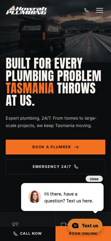
Howrah Plumbing pairs a Tasmanian landscape with bold white and orange type. The opening screen offers a booking route beside emergency contact. Further down, residential services sit alongside commercial and civil work, giving different customers a clear starting point. The footer credits Wally for the site.4
We measured 96/100 for mobile performance and a 1.49-second LCP. The homepage navigation exposed 14 individual service destinations and 0 local-area destinations. A call or booking control remained visible after scrolling.1
The strongest lesson is how the site uses its location as part of the design. The landscape, regional wording and local business story work together. Borrow that approach with photographs and language that belong to your service area. Howrah also separates the work into useful categories: a household drain problem and a water connection project lead to different information. On mobile, inspect the bottom booking bar with the chat prompt open because both occupy the same part of the screen.
2. Salmon Plumbing, Brisbane
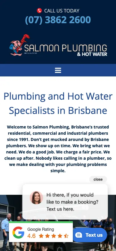
Salmon Plumbing makes hot water a major part of its Brisbane website. The desktop menu separates heat pumps, gas, solar and electric systems, with further routes for individual heat pump brands. Residential and commercial work sit in separate navigation groups.5
We measured 81/100 for mobile performance and a 3.42-second LCP. The homepage navigation exposed 23 individual service destinations and 5 local-area destinations. A call or booking control remained visible after scrolling.1
This structure is useful when customers arrive with a particular product or system in mind. Give them a route that matches that question, then explain the job and next step on the destination page. Salmon also places a service request form beside its team image on desktop. On mobile, those elements stack below a longer introduction. Decide how much copy the reader needs before reaching the form and inspect the layout with review and chat widgets present.
3. Jet Plus Plumbing, Berwick
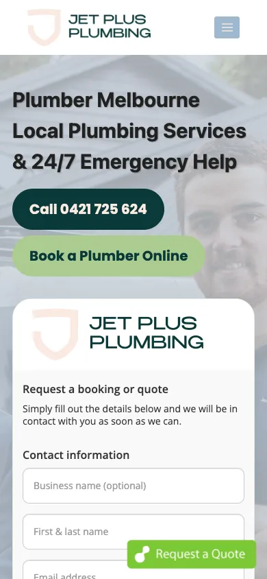
Jet Plus Plumbing gives Melbourne customers a telephone button and an online booking choice in the hero. An embedded request form starts immediately below them on mobile. Its wording tells customers that the team will respond to the request, setting a useful expectation before they enter their details.6
We measured 79/100 for mobile performance and a 5.29-second LCP. The homepage navigation exposed 15 individual service destinations and 108 local-area destinations. A call or booking control remained visible after scrolling.1
The site is a useful reference for making a request process explicit. Use labels that distinguish asking for a booking from securing an appointment. Jet Plus also exposes a large set of local destinations in its desktop navigation. Our area count includes several services for the same suburb, so it describes URLs rather than unique suburbs. A smaller business should choose the areas it serves and write useful local detail before building a similarly extensive menu. Keep the floating quote control from covering fields in the embedded form.
4. O'Shea Plumbing, Melbourne
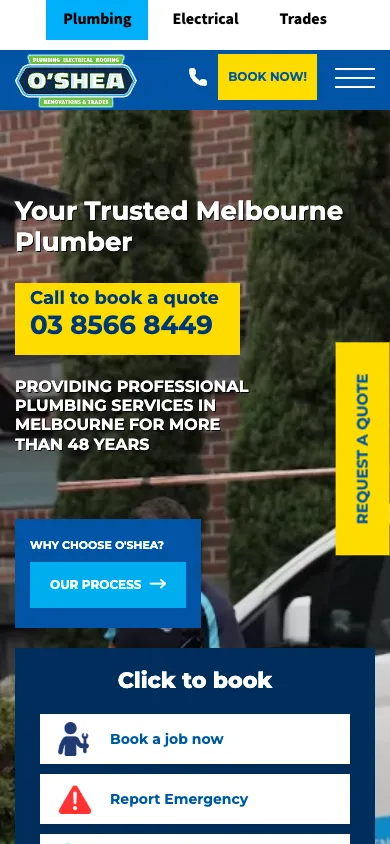
O'Shea Plumbing separates booking a job, reporting an emergency and making a general enquiry. The desktop page shows those routes beside the hero, while the mobile layout includes a header phone icon and a prominent quote tab. The business photograph and blue and yellow colours connect the contact panel to the wider brand.7
We measured 74/100 for mobile performance and a 4.46-second LCP. The homepage navigation exposed 18 individual service destinations and 4 local-area destinations. A call or booking control remained visible after scrolling.1
The useful lesson is to distinguish the customer's next action. A planned appliance installation and an urgent leak need different questions. Give each route a short label that explains what happens next, then carry that distinction into the form or phone response. Check the mobile layout before adding another fixed button: the side quote tab already occupies part of the narrow screen. For planned work, explain whether the booking choice requests a callback or confirms a time.
5. Jetset Plumbing, Brisbane and Gold Coast
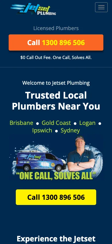
Jetset Plumbing names Brisbane, Gold Coast, Logan, Ipswich and Sydney near the main call button. The opening mobile screen repeats telephone contact around the business introduction, using orange and yellow buttons against a dark blue background. Customer review content appears further down the homepage.8
We measured 73/100 for mobile performance and a 3.37-second LCP. The homepage navigation exposed 0 individual service destinations and 6 local-area destinations. A call or booking control remained visible after scrolling.1
Copy the coverage clarity when you serve several distinct areas. Keep that list close to the contact choice so customers check location before getting in touch. A short list of regions is easier to scan than a hero filled with every suburb. Carry the same area names into the navigation and use individual destination pages for detail. If you use call tracking, include number-to-link matching in your checks so a changed visible number still opens the intended telephone destination.
6. Unrivalled Plumbing & Gas, Perth
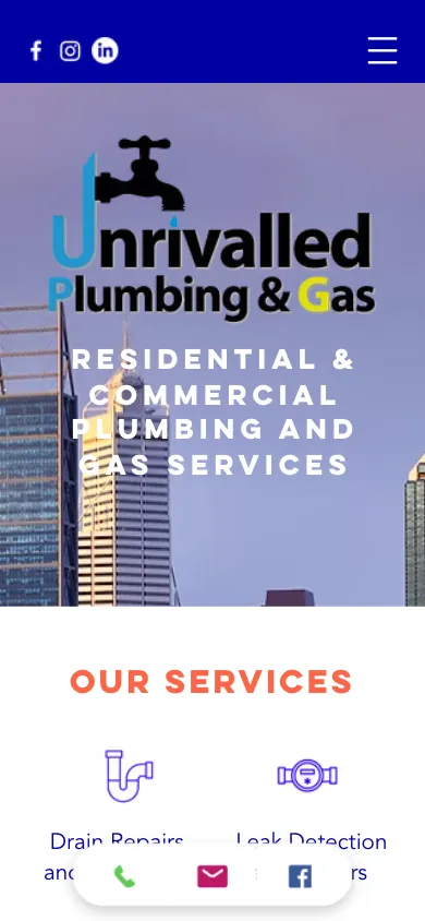
Unrivalled Plumbing & Gas uses a Perth skyline, a large business mark and a short list of plumbing and gas services. Its homepage moves from that overview to an introduction, supplier logos and a customer testimonial. A compact mobile strip carries phone and email icons.9
We measured 70/100 for mobile performance and a 8.23-second LCP. The homepage navigation exposed 0 individual service destinations and 0 local-area destinations. A call or booking control remained visible after scrolling.1
Study this approach if the first job of your website is to introduce the business and invite contact. The service overview gives visitors a quick way to recognise their problem without a large menu. Keep the list specific enough to distinguish the jobs you handle, such as backflow testing or leak detection. The fixed strip is small, which preserves room for the page itself. Give each icon a clear accessible name and check the spacing with a thumb on a real phone.
7. Akin Pro Plumbing, Sydney
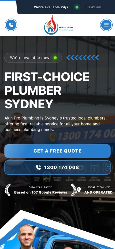
Akin Pro Plumbing introduces its Sydney business with photographs of the team and work vehicles. A recent-project section continues that visual story below the service cards. The mobile hero offers quote and call buttons together and displays a review badge underneath. Its footer carries an UpRank credit.10
We measured 70/100 for mobile performance and a 27.02-second LCP. The homepage navigation exposed 8 individual service destinations and 18 local-area destinations. A call or booking control remained visible after scrolling.1
Borrow the connection between the opening photograph and the work gallery. Select images that show the kinds of jobs you want customers to recognise, then explain what each project involved. Akin's long LCP in this run also makes it a useful reminder to test the delivered media. Keep the photographs that explain the business, size them for their display area and recheck performance with the final effects and integrations loaded. Use the overall score alongside the timing measures when deciding what to investigate.
8. Blueline Plumbing & Gas, Canberra
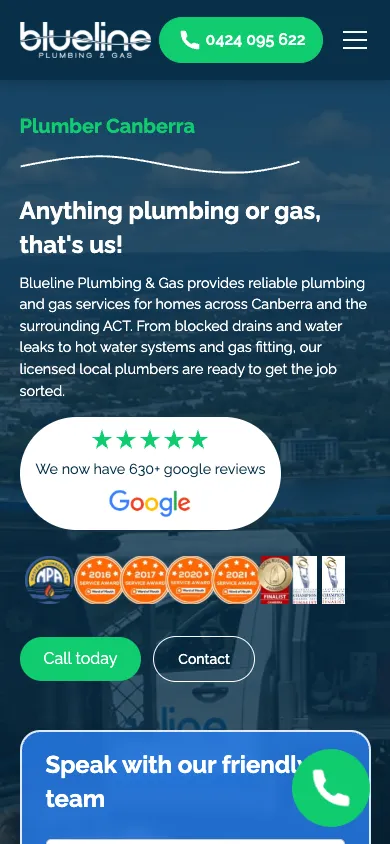
Blueline Plumbing & Gas leads with Canberra and a plain description of its plumbing and gas work. The desktop hero puts a short enquiry form alongside the introduction and review panel. On mobile, the header retains a bright green telephone button while the form moves further down the page.11
We measured 67/100 for mobile performance and a 5.54-second LCP. The homepage navigation exposed 12 individual service destinations and 0 local-area destinations. A call or booking control remained visible after scrolling.1
The design gives a local customer several useful answers together: the trade, service area and next step. Borrow that proximity when arranging your own first screen. The shift between desktop and mobile is also instructive. A form that fits beside a desktop headline becomes a longer vertical journey on a phone. Prioritise the call route and the opening service information, then check the form's final control at the narrower width. Keep labels clear when several green contact controls share the page.
9. Clear Plumbing Solutions, Sydney
Clear Plumbing Solutions is a Kavera Launch website for a Sydney plumbing business. We built the page around a clear business introduction, service sections, a work gallery, customer feedback and a callback form. Its blue mobile call bar stays available while the visitor scrolls.12
Our mobile test recorded a score of 66. The first-screen call link and fixed call bar both passed the same visibility checks applied to every example. Customer feedback was visible on the homepage.1
The design lesson is focus. A visitor first sees the business name and Sydney service message, then follows the page through the work and contact options. The gallery gives customers something concrete to browse while the fixed call bar keeps the next action close. This is a useful reference for a local business that wants an organised introduction and a straightforward way to get in touch. Keep the photographs, service wording and contact labels consistent so each section feels like part of the same business.
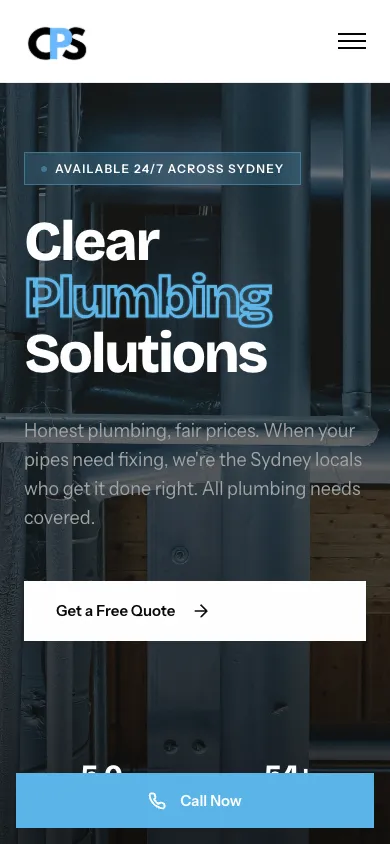
Kavera note: We built Clear's Launch website with its services, work gallery and callback route in one place. The mobile call bar gives visitors a direct next step while they explore the business.
10. Plumbdog, Perth
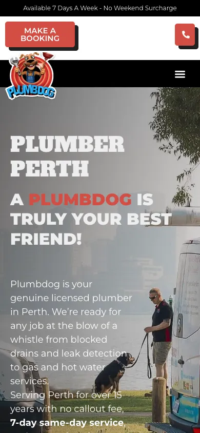
Plumbdog carries its dog identity through the logo, headline, copy and work-van photograph. The Perth plumbing description remains prominent, with a booking choice and telephone icon above it. The result is a distinctive introduction built around one recognisable idea.13
We measured 64/100 for mobile performance and a 4.62-second LCP. The homepage navigation exposed 5 individual service destinations and 0 local-area destinations. The first-screen phone link scrolled away without a qualifying fixed contact control at our checkpoint.1
The idea to borrow is consistency. Choose imagery and language that fit your business, then keep practical labels literal enough to navigate. A customer should recognise a blocked-drain service even when the surrounding copy is playful. Plumbdog's large headline and opening text also show how much space a strong hero takes on mobile. Keep the next action easy to recover after scrolling and give supporting service information enough room below the opening image.
11. Absolute Plumbing Australia, Darwin
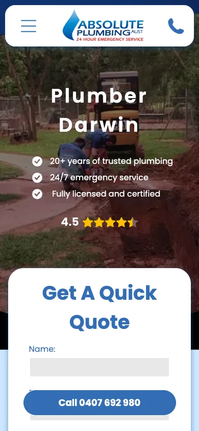
Absolute Plumbing Australia opens with its Darwin service area and a quick-quote panel. The panel fits across the desktop opening section and starts within the first mobile screen. A fixed telephone button gives mobile visitors another way to make contact.14
We measured 63/100 for mobile performance and a 3.28-second LCP. The homepage navigation exposed 7 individual service destinations and 5 local-area destinations. A call or booking control remained visible after scrolling.1
The useful pattern is the short distance between the business introduction and the start of an enquiry. On mobile, the panel's later fields and submit control extend below the fold. Measure the whole form when deciding where to place it. Make its service choices match the work you take on, then explain what happens after submission. Absolute's navigation also separates hot water, leaks, septic work and other jobs from its local-area routes, giving customers two ways to find relevant detail.
12. Horncastle Plumbing, Adelaide
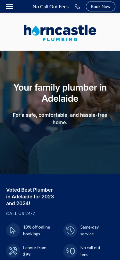
Horncastle Plumbing pairs a photograph of its plumber with an Adelaide family-service message. Further down, a short process explains contact, discussing the job and arranging attendance. The header keeps calling and booking together. The footer credits Argon for the website.15
We measured 56/100 for mobile performance and a 15.15-second LCP. The homepage navigation exposed 36 individual service destinations and 0 local-area destinations. A call or booking control remained visible after scrolling.1
Borrow the process explanation when customers regularly ask what happens after they call. Describe the steps your team actually follows and keep the wording consistent with the booking form. Horncastle also exposes a substantial service menu, including hot water system types and brands. Group those destinations around customer choices so the menu stays usable. Its mobile LCP was the second longest in this sample, making image and integration checks a useful part of studying this design.
What do the best plumber websites have in common?
Clear telephone contact was the most consistent feature: all 12 sites showed a telephone link before scrolling and 11 kept a call or booking control fixed afterwards. Mobile performance varied much more, from 56 to 96.1
| Check | Result from our 12-site sample | What to do with it |
|---|---|---|
| Telephone link before scrolling | 12 of 12 | Pair a clear label with the correct telephone destination |
| Fixed call, quote or booking link after scrolling | 11 of 12 | Keep contact available while customers read further |
| Complete enquiry form on the first mobile screen | 0 of 12 | Count all fields and the submit control, including embedded forms |
| Homepage JSON-LD present | 11 of 12 | Check that the structured data accurately describes the business |
| Visible review or rating display | 11 of 12; one unresolved | Horncastle's review heading loaded without review content in our capture |
| Lighthouse mobile score | 56 to 96; 1 of 12 at 90 or above | Run the finished homepage with its media and integrations |
| LCP | 1.49 to 27.02 seconds | Inspect the main content's timing alongside the overall score |
| Service destinations in homepage links | 0 to 36 | Count separate service URLs, excluding general service hubs |
| Local-area destinations in homepage links | 0 to 108 | Include service-location URLs; this is not a count of unique suburbs |
The form result is especially useful when comparing screenshots. Jet Plus and Absolute place enquiry fields near the top of mobile pages, yet their full forms continue below the screen. Judge the complete customer task when choosing a layout.
Service navigation needs the same care. Salmon gives hot water customers several system choices, while Jet Plus exposes many service-area destinations. Start with the questions customers ask about your own work. Build separate pages where there is enough useful detail to answer those questions and maintain it.
For loading, Howrah shows that a prominent visual identity and a high mobile score belong in the same brief. Akin's much longer LCP shows why the headline performance score deserves a closer look. Keep the imagery that explains your business and check how quickly its main content appears.1
Which improvements should you make to your own plumbing website first?
Start with the path from arrival to enquiry, then improve the service information and loading experience. Use the same sequence for an existing website or a new build.
- Open your homepage on a phone. Check that the trade, service area and next action are clear before opening the menu. Confirm the telephone link points to your number.
- Scroll with chat, consent and booking tools present. Check for covered controls and text that becomes hard to read over an image.
- Complete a test enquiry through your own form. Check the customer confirmation and the notification your team receives, then repeat it on mobile.
- Review the service menu against the work you take on. Give each useful destination a clear purpose, relevant photographs and a contact route.
- Run mobile performance tests with the final images and integrations. Compare several runs after changes and follow the longer-term result in real visitor data.
For a new website, agree the page scope, content responsibilities and contact process before design begins. A blocked-drain specialist and a business serving residential and commercial customers need different amounts of service detail. Your brief should say which jobs matter most and what customers need to know before calling.
Kavera's published Launch Website subscription is $49 per month plus $199 setup, both excluding GST, with hosting and maintenance included. Domain registration is separate. Compare the included pages and support with the content and booking process your business needs.16
Our plumber website design page explains the available approach. Use these examples to specify the service information, photographs and mobile contact behaviour you want in your own site.
Common questions
What pages should a plumbing website have?
Start with a homepage that explains your services and coverage, an about page and an easy contact route. Give services such as drain repairs or hot water replacement their own pages when customers need more detail. Add local pages with useful coverage information. Use photographs of your work and keep each page focused on the job the customer needs.
Should a plumber’s website have online booking?
Use online booking for planned work when your team supports the process it promises. Explain whether the customer is requesting a callback, asking for a quote or reserving an appointment. Keep a telephone route for urgent jobs. Test the full journey through your system, including the confirmation and the notification your team receives.
How much does a good plumber website cost in Australia?
The cost depends on page scope, content, integrations and ongoing support. Kavera’s Launch Website subscription is $49 per month plus $199 setup, both excluding GST, with hosting and maintenance included. Domain registration is separate. Compare page allowances, content work and support when choosing a package, then agree the scope of any booking integration or larger service library.
Are plumber website templates good enough?
A template is a useful starting point for a plumbing business with straightforward content and contact needs. Choose one with readable mobile layouts, clear service navigation and room for your own photographs. Check the editing options and page allowances before committing. Test the finished version with your actual copy, images and booking tools to assess its loading and usability.
Where should the phone number go on a plumber website?
Put a clearly labelled telephone link in the first mobile screen and keep a contact route available as visitors scroll. Repeat it where customers choose a service or finish reading a page. Check that the destination matches the displayed number. In our sample of 12 Australian plumbing websites, every homepage had a visible telephone link before scrolling.
How fast does a plumber website need to load?
Aim for a Largest Contentful Paint of 2.5 seconds or less for at least 75% of real visits, following Google’s good LCP threshold. Prioritise the opening image or text, compress oversized media and review third-party tools. Run mobile tests on the finished page, then use real visitor data to track loading over time and check the effect of changes.
Sources
- Kavera plumbing website tests: method and 12-site sample, 9 October 2026Kavera Digital. Accessed .
- Lighthouse performance scoringGoogle Chrome Developers. Accessed .
- Largest Contentful PaintGoogle web.dev. Accessed .
- Howrah Plumbing homepageHowrah Plumbing. Accessed .
- Salmon Plumbing homepageSalmon Plumbing. Accessed .
- Jet Plus Plumbing homepageJet Plus Plumbing. Accessed .
- O'Shea Plumbing homepageO'Shea Plumbing. Accessed .
- Jetset Plumbing homepageJetset Plumbing. Accessed .
- Unrivalled Plumbing & Gas homepageUnrivalled Plumbing & Gas. Accessed .
- Akin Pro Plumbing homepageAkin Pro Plumbing. Accessed .
- Blueline Plumbing & Gas homepageBlueline Plumbing & Gas. Accessed .
- Clear Plumbing Solutions homepageClear Plumbing Solutions. Accessed .
- Plumbdog homepagePlumbdog. Accessed .
- Absolute Plumbing Australia homepageAbsolute Plumbing Australia. Accessed .
- Horncastle Plumbing homepageHorncastle Plumbing. Accessed .
- Website pricingKavera Digital. Accessed .
Let’s talk.
Tell us what your business needs and we will point you to the right option.
plumber website design